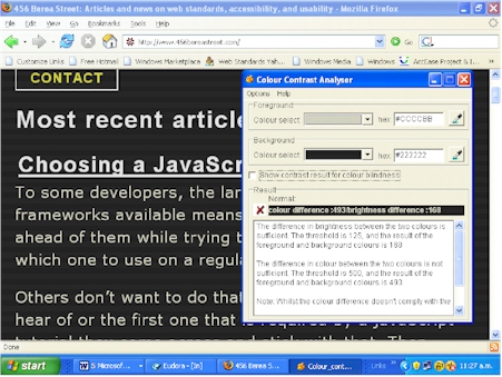
Colour contrast is really important to me, and lots of other people with partial sight. I don’t use any enlarging software – Firefox works well enough, even if some sites break, which they often do. Sadly most web site designers and builders simply don’t get it.
So here I go, harping on about it again.
www.456bereastreet.com was recommended as a useful site for access info. Well maybe… If we want our sites and the information they contain to be credible then we have to walk the talk. Here’s an example of a site where they just don’t quite get it.

The site is generally grey text on a white background, which actually meets the accessibility standard for colour contrast. But wait there’s more. The site attempts to helpfully offer a high contrast option which fails miserably on almost all counts, passing just one colour blindness test. The measurement tool I use is from Vision Australia, based on the W3C standard, and gives accurate, trustworthy and reliable results in my experience.

You really gotta wonder!


